
Google ecommerce site Redesign
Better, Faster, More Accurate Corp Asset and Service Management
The redesign aims to automate and streamline Google's IT assets and all related services (hardware, software, cellular, AV). This product will provide strategic support and a framework that will allow rich functionality within the ecommerce experience and achieve their goal of making Googlers more productive.

Challenges
Design: The older site lacked consistency and alignment with other Google Material design related products.
Research: The product wasn’t considered intuitive and lacked the richness of the modern day ecommerce experience when it came to product details, order management, and hardware policies.
Usability: Confirmation notifications wasn’t present, filtering tags were limited, upgrading hardware was confusing, stock levels were not visible, bundled items could not be created, managerial approval needed improvement.
Tech Support: Automation within the product’s purchase life cycle was an issue, especially with the workforce growing.
Fulfillment: Proper communication and shipping status’ surrounding users orders was not present

“When browsing in the storefront, items are too cluttery. It doesn’t look that simple and clean. I used to work for Apple, there would be a focus on the product and not the things around it.”

Original ecommerce site design
Design Goals
To address the above issues, I set out to define the goals and constraints for this redesign.
Responsive: Make the site responsive for users who need to order items on the go.
Improve customer satisfaction: Using research on older site to better understand user goals.
Reduce time to complete task: Make important information visible and user flows intuitive.
Better content strategy: Create quality and consistent content.
Modernize: Align site to Material design principles.
Constraints
Integrate third party tools: The third party system may have limitations not allowing all Google design interactions to be properly implemented.
My Role
My role was to manage and lead UX initiatives to support the business analyst team, the engineer team, and key stakeholders. This involved kicking off strategical workshops to identify user pain points, consultation, creating all interaction and user interface design deliverables, prototyping (low fidelity), Usability testing, investigative research, roadmapping, strategical quarterly planning, and critical user journey workflows.
Design Process

Understand: A 3 day kickoff was put in place to understand business goals, UX roadmapping for MVP, and new features for each critical user journey.

Audit: Since we were using a 3rd party integrated tool, an investigation of the framework was done to better understand the limitations of the product, interaction flows, and how basic user journeys were mapped out, with the intent to align back to Google’s material design.

Research: A competitive analysis was done on different ecommerce sites to understand different shopping experience mental models.

Sketch: Reimagining the new storefront took cleaning up. Sketching out the critical user journeys, organizing the information architecture, and wire framing the experience was key to this stage.

Design: After flows / CUJs and information architecture were approved, alignment to Google material design was the next key element in making this product convey a visual language that synthesizes principles of good design with the innovation of technology and science.

Usability testing: In order to get feedback from users about the MVP designs, a usability study testing the designs was put into place so that I could elicit feedback from users about new designs and flows and improve the overall experience.
Prototype: Static designs couldn’t convey the interactions that go into a product so prototyping the journeys were crucial into understanding the end to end product.
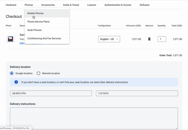
MVP Design
For the MVP we didn’t want to roll out the entire redesign to all Google locations, so we chose a city with a smaller controlled group to deploy to and continue iterating while we worked through bugs and accessibility issues. Alongside deployment we ran a satisfaction survey which would monitor what’s working and not working from the users perspective. After 3 months of results we were able to assess our findings and even though the redesign was received overall satisfactory, 2 key areas were identified as problem areas and they were Order History and Cellular service plans.


Google ecommerce MVP desktop redesign


Google ecommerce MVP responsive mobile redesign
Post MVP Strategy
Order history was the area we received the most negative feedback so I came up with a iteration plan to estimate the effort it will take to review all of the issues with this section, redesign with new features, test & validate, and work with developers to build.

Research results from the Post MVP study
UX tracker estimates for redesign
Order History Pain Points
While Investigating over 100 tickets and tracking them into a document I was able to find common user pain patterns and started to build recommendations from these use-cases. The original redesign didn’t give enough information to the user surrounding the delivery life cycle. The mental model users were accustomed to was seeing a delivery date and status for complex shipments that needed managerial approval. We also missed an opportunity to build internal messaging tools just in case questions needed to be asked about the items. It took 2 clicks to get into the users order details, and if they were able to make it that far without escalating a ticket the information was overbearing and filled with unnecessary information.

Order History MVP highlighting points of confusion

“Ordered items almost a week ago with no light at the end of the tunnel, no communication for delivery or anything beyond in progress.”
Order History problems solved
The first huge change was getting rid of the additional step it took users to get into the details for their order. I also reconstructed the layout minimizing the overwhelming information and added in an estimate delivery date, individual status for each item, and an actions panel with prioritized us-cases that were important for the users. The actions panel was a crucial addition because it surfaces the most important actions a user could take such as canceling and escalating problems such as wrong deliverd item or general questions about their undelivered or delivered items. After testing these additions it was positively received by our test participants.


Order History post MVP after usability testing
Cellular service pain points
Felt that the MVP took care of their basic ordering needs but when it came to upgrading there were missing features such as being able to compare phones and service plans side by side instead of reading information in list view. Another takeaway from the users were letting them see what phones and service plans they currently have while browsing for a new phone or service plan. One last point was messaging surrounding plans unavailable or available with your current phone compatibility.

Cellular service MVP
Cellular Service Problems Solved
The first change was implementing a list and grid mode so that users could view their items side by side. This was received well with a lot of users. Also there was an improvement to the bundling option designing in a guided flow so that users always have a birds eye view of the phone and service plan they currently have. The last change was adding in content copy to inform users on phones and service plans that may not be supported or compatible with their phone and service plan.


Cellular service and phone post MVP after usability testing
Impact
Features such as communication messaging and adding canceling to Order history helped to minimize the velocity of tickets coming in from the release of the original MVP. Adding the cancel feature also saved the company millions of dollars by stopping unnecessary equipment to be sent out by an order mistake and users forgetting to set up a return. Also adding simple features to upgrading service plans such as a reference guided flow and a grid toggle added stronger satisfaction amongst users.

Research captured 6 months after MVP alongside design improvements
Next Steps
After finishing up Quarter 2 work, I reanalyzed the research documentation and carved out where the next UX fixes should go for Quarter 3 and Quarter 4. The areas users were having the next set of pain points were surrounding managerial approvals, Eligibility communications for upgraded hardware, and Search Navigation logic. After proposing the next work a strategic discussion to prioritize these items were had between the Engineer, Management, and UX team. A weekly plan was set up including design mockup, testing, and review dates through out the last two quarters.

Next step diagram highlighting improvements and satisfaction of current issues
What Could Have Been Better
Scoping: Design built more that what the engineers could build leaving flows and journeys to not be built correctly during MVP
Roadmap: Bringing in UX earlier to assess a better deployment timeline
Validation: Testing designs before development
Product Manager: Having someone focus on product excellence